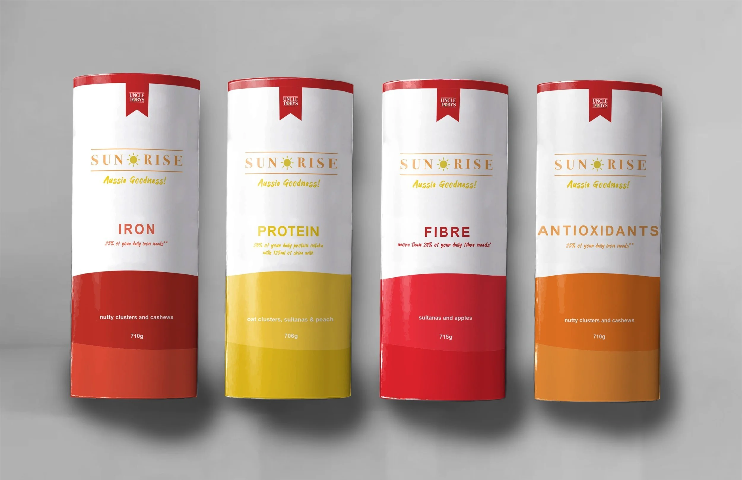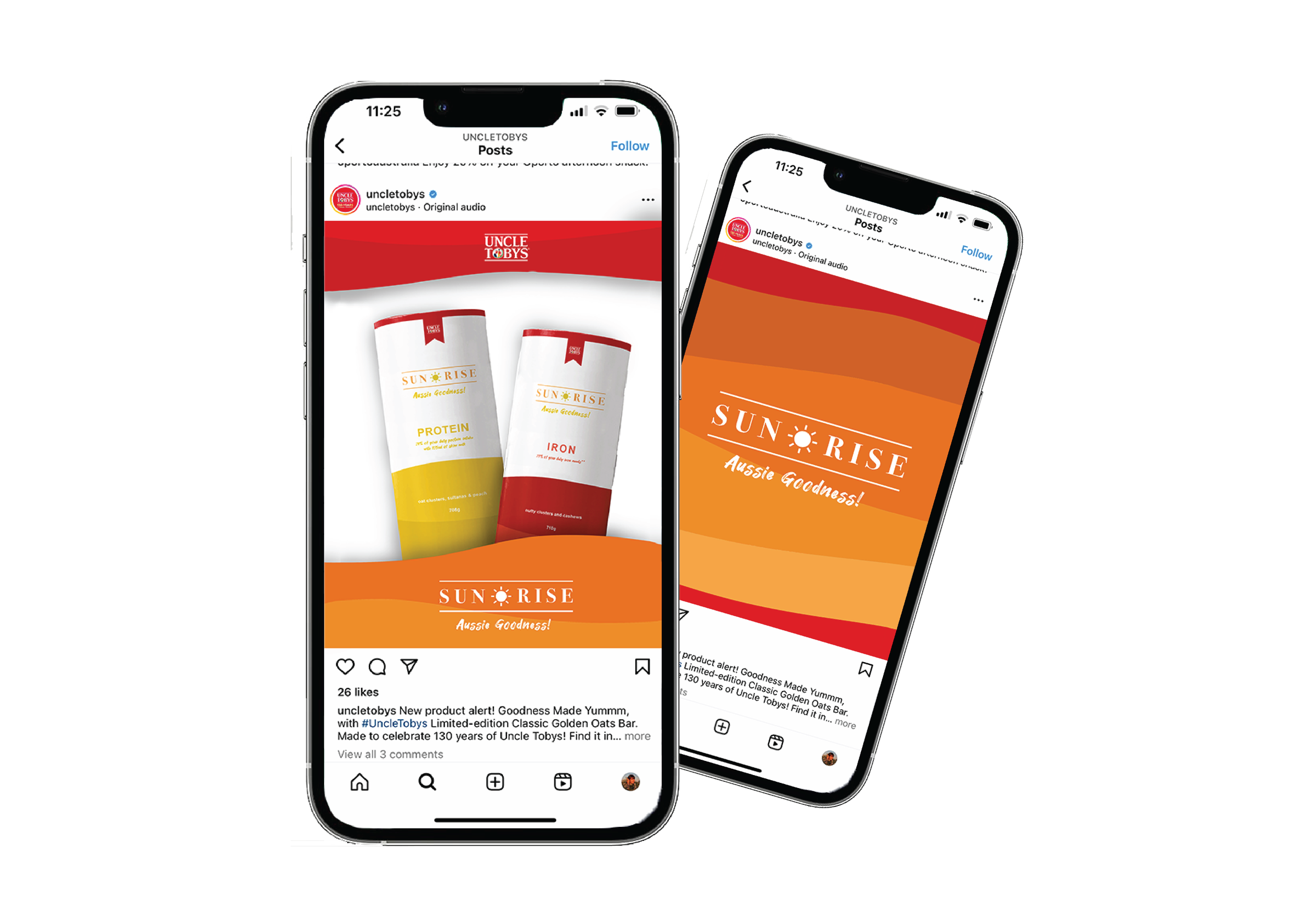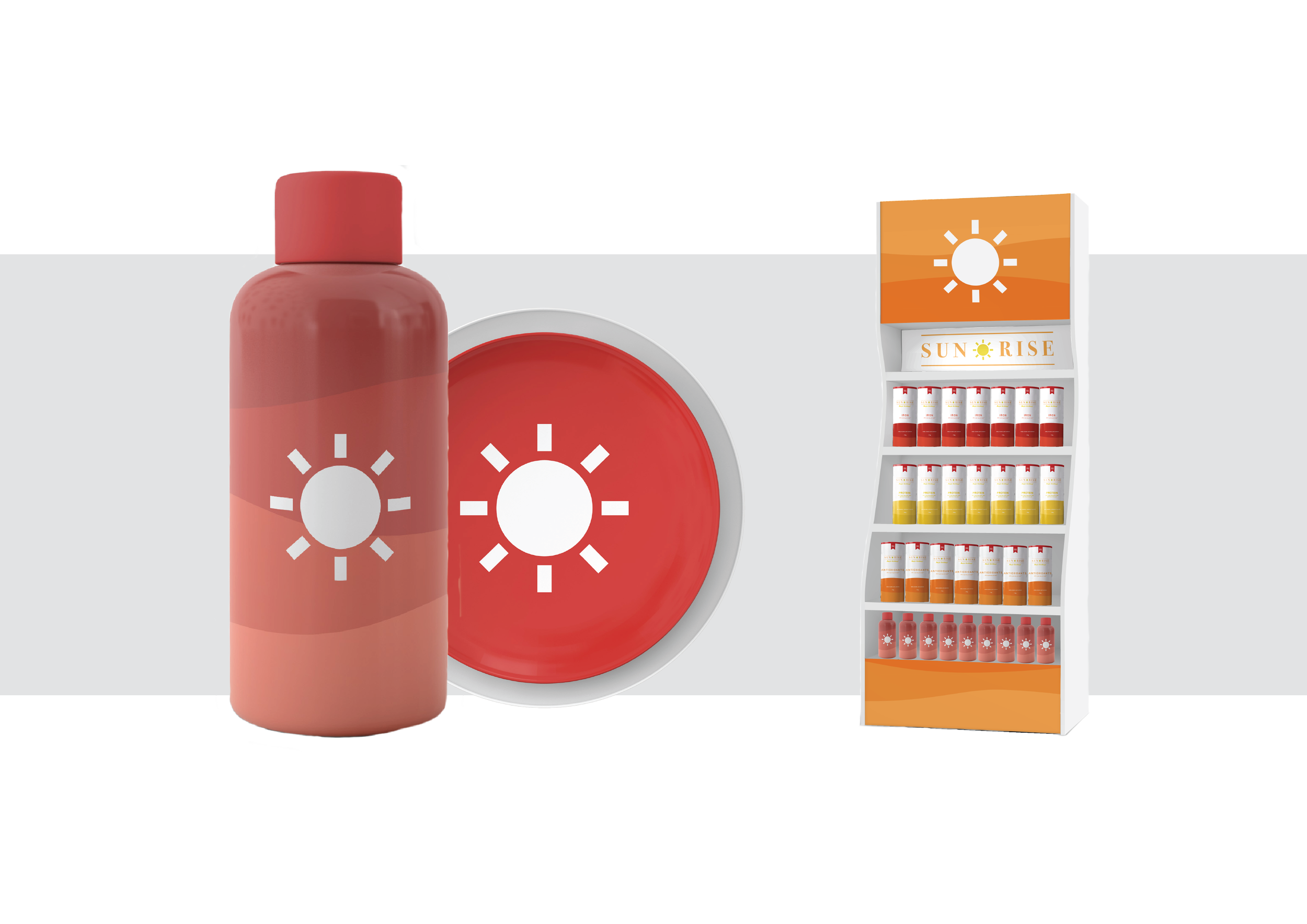


SUNRISE
This project was about reimagining an existing brand and improving on it’s existing packaging. In this case Uncle Tobys Plus cereal brand was chosen. The brand itself is a strong brand but the general packaging of cereal hasn’t changed at all throughout the years.
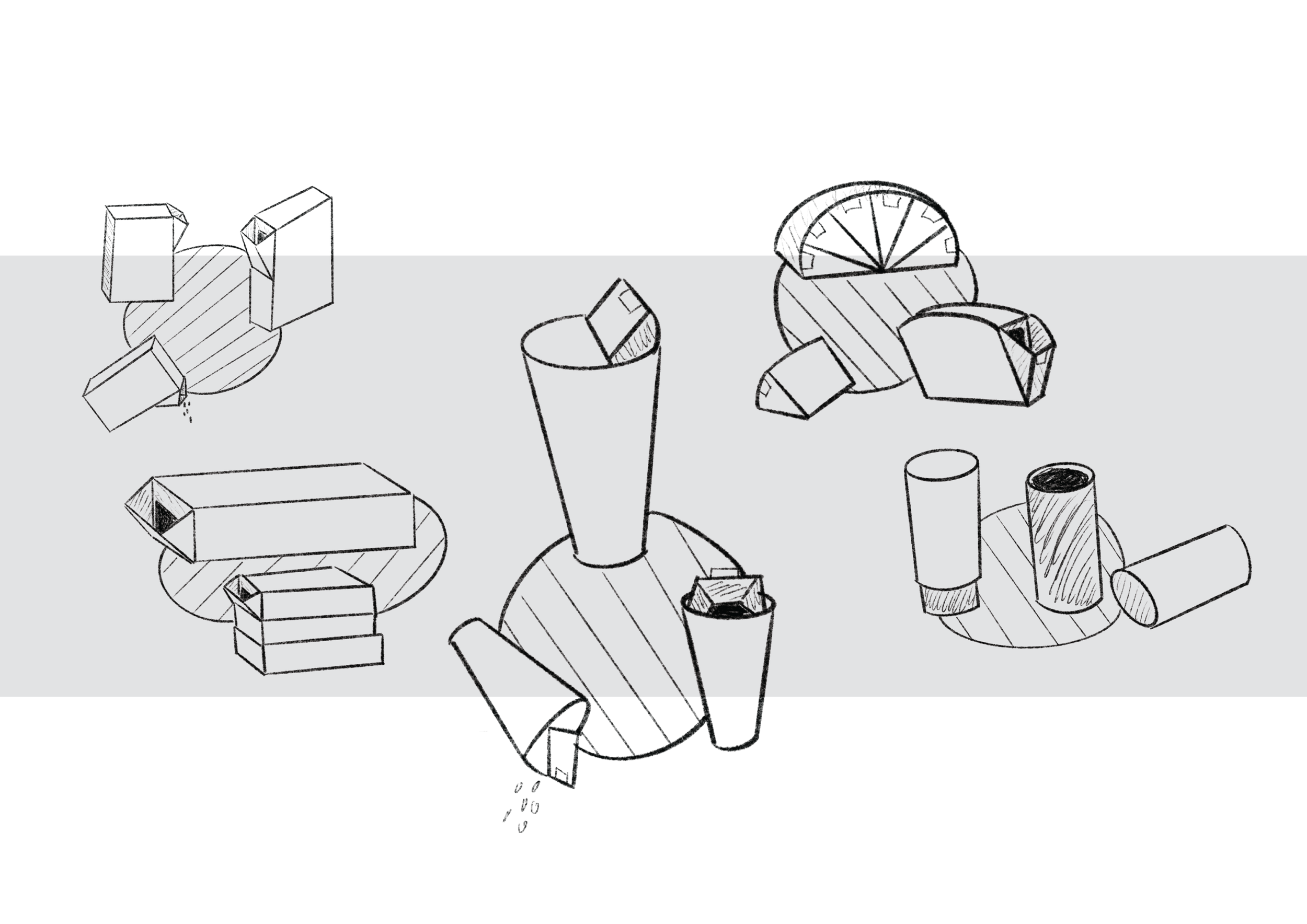
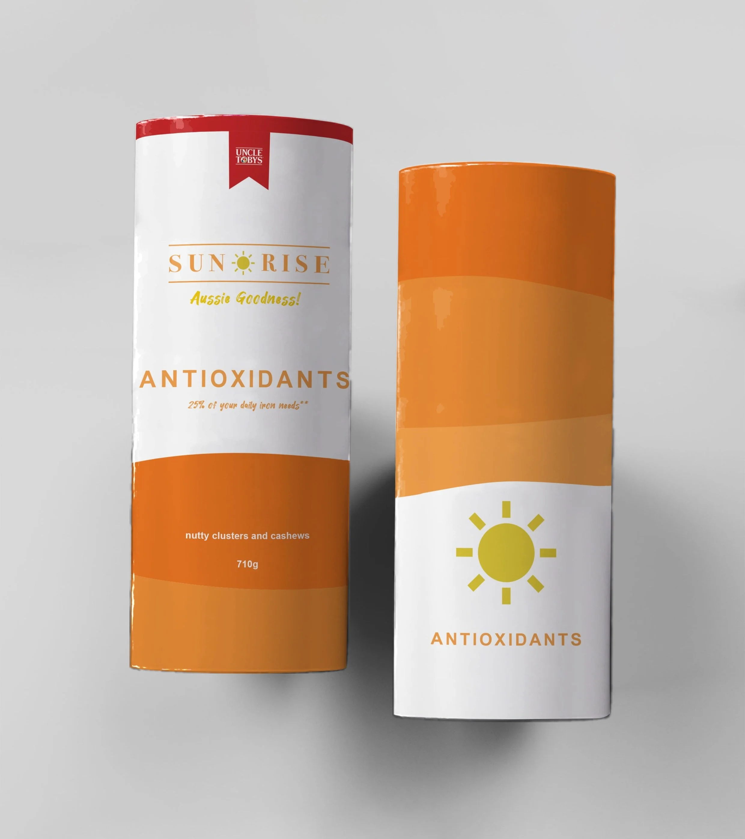
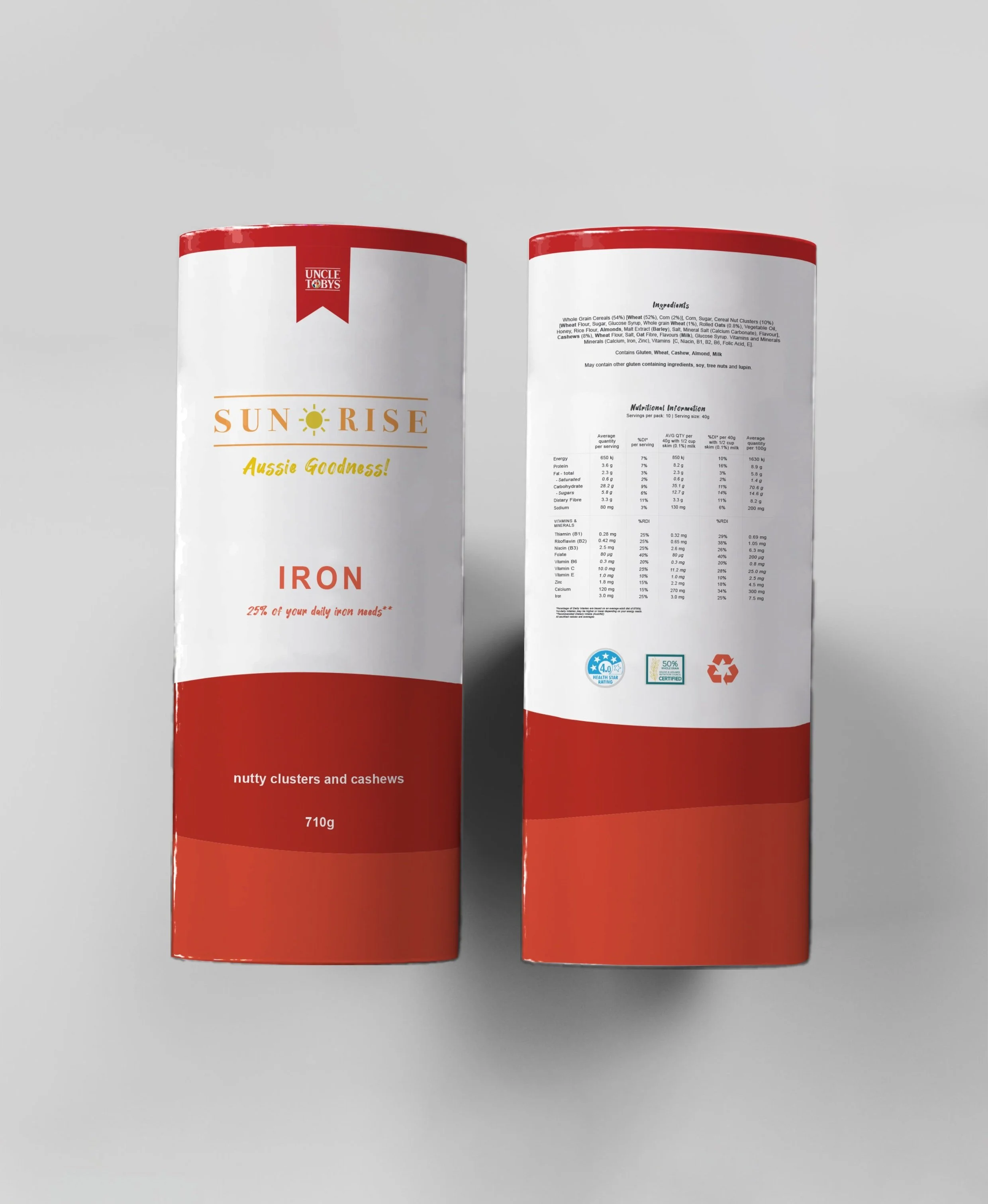
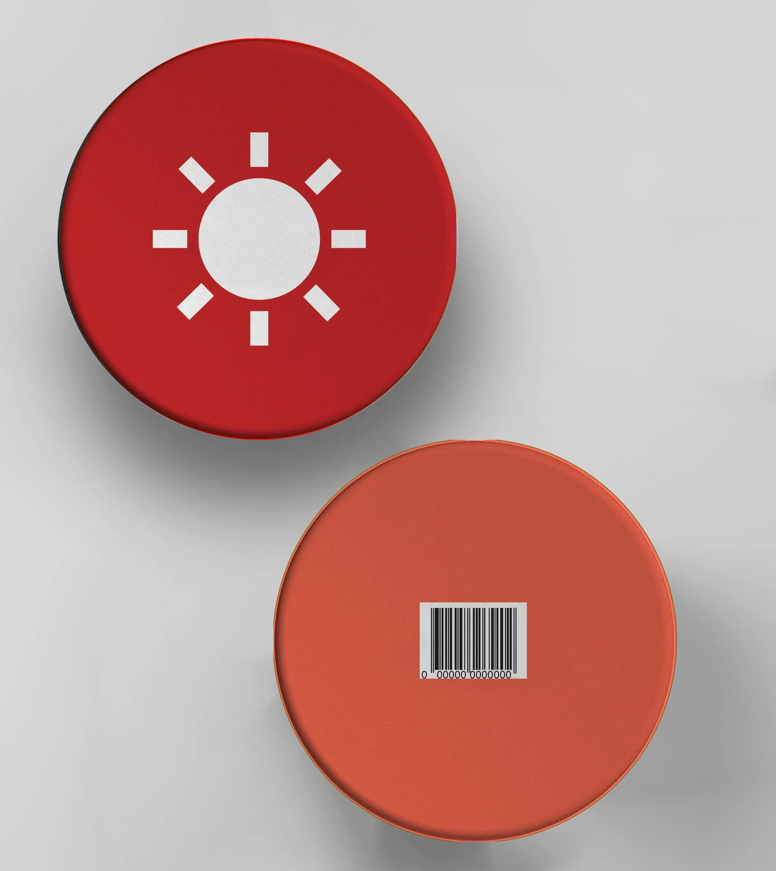
The rectangular box is difficult to fit into cabinets, difficult to stack as well as difficult to hold and pour out of. With the new SUNRISE brand, the packaging is now a cylinder to be easier to hold and pour out of. The double cylinder design also creates a perfectly sealed packaging when closed, meaning the cereal is well protected within the packaging.
Branding & packaging design, university project